TINY ROOMS
New Color Palette & UI Refresh
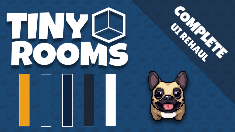

We’ve been working hard to refine Tiny Rooms’ overall look and feel. Consistency is key, so we developed a custom color palette in Illustrator to ensure all our visuals align with the atmosphere we want to create - cozy, playful, and inviting.
We also changed the game logo. We went for a cleaner icon that's way more polyvalent and speaks volumes in terms of what the game is about. It represent, obviously, the tiny rooms while also showing a bit of quirkiness.

- Inspiration & Research: We gathered references, tested color combinations, and iterated in Illustrator until we found a palette that felt just right.
- Implementation: We applied these colors to our UI elements, icons, and backgrounds, ensuring a cohesive experience throughout Tiny Rooms.
- Challenges: Balancing readability with aesthetic flair was tricky at times. We adjusted contrast and hue to maintain clarity without sacrificing style.

- Navigation & Icons: Redesigned icons to fit the new style, making them more intuitive and uniform.
- Menus & HUD: Updated the menu backgrounds and text colors for better readability and a more polished look.
- Game Scenes: Subtle color changes in the rooms and objects tie everything together, reinforcing our new visual identity.

- Continue working our UI: It'll keep improving!
- Features: We're working very hard to add new features to the game - Stay tuned
- Feedback: We want to hear from you! Let us know if the new look feels cohesive or if there’s anything we can improve.
Leave a comment
Log in with itch.io to leave a comment.